Monday, October 25, 2010

Concept

Tiny House

Exploring the microgreen side of sustainable architecture, the need to conserve resources and reduce our individual carbon footprints.

According to the National Association of Home Builders, the average home size in the United States was 2,330 square feet in 2004, up from 1,400 square feet in 1970.

Idea is to live with less but to get more out of the experience. The society lists healthier, more cost-effective living and a better environment. People who live tiny have fewer possessions and lower utility bills and constructions of these homes require fewer building materials and less land, so they are more efficient and sustainable. Living concepts under 1,000 sq. ft.

Goal is to create an inventive compact living solutions to emphasize design innovation when dealing with tiny floor plan. Less is more - reduce how much we take in and how much space we take up.

Design compact set of furniture used to maximize usable space.

“By making a large impact on the environment, tiny house dreams big.”

Reduce and reuse, but responsive to light, air, and nature with windows and decks making up for minimized living areas.

Sunday, October 17, 2010

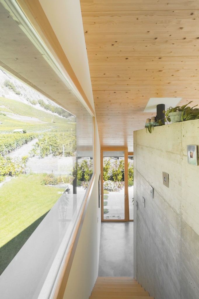
Analyzing Natural Light - "Framing the Landscape"

Interpretation: "Framing the Landscape" - using window of different sizes allowing natural light. The transform space by architecture becomes an extension of the built environment, seeking a return to the autonomy of landscape.


The kind of bareness to the elements offered by a spectacular view with its resistant materials and capacity to glaze large surfaces, even opposing the winds.

Felipe Assadi + Francisca Pulido: BUZETA HOUSE


Along the hallway of this residence as a light installation, a ray of natural light progressing through series of wall layers. 

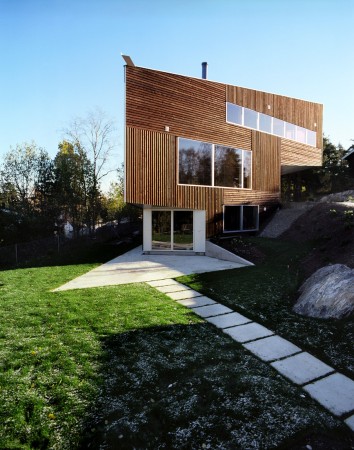
Felipe Assadi + Francisca Pulido: RAVEAU HOUSE


Bringing patterns into the house in the day and letting points of light escape at night is a subtle and poetic integration of the earth into the environment otherwise made of wood, glass and concrete.

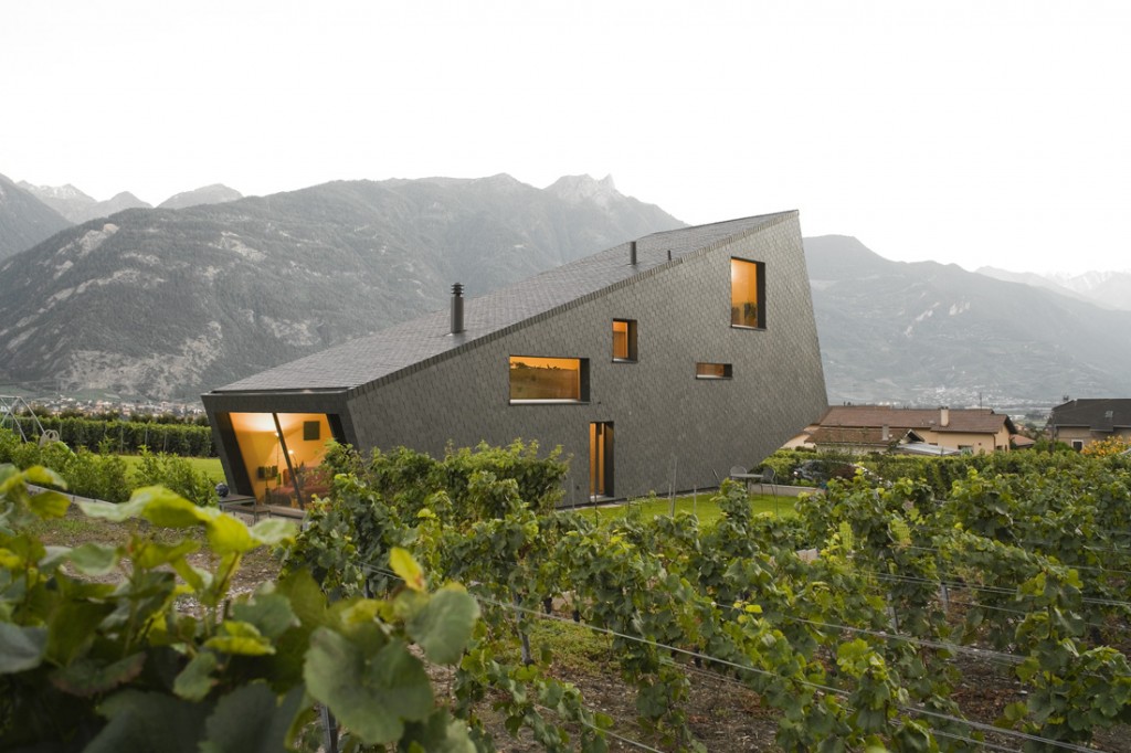
Nunatak Sarl Architectes: ZUFFEREY HOUSE


Saturday, October 16, 2010

Embracing The Natural Contour

The willful contrast between interior and exterior and the acceptance of the formal typology of the architecture, mark a different way to approach contemporary residential architecture in a natural setting. It is very effective to use windows to make use of views and integrating them into the very conception of a house.

This house underlines to what extent house architecture is influenced by climate. 
Correia Ragazzi Architect: CASA NO GERES

The outdoor terraces that render exterior and interior almost indistinguishable in this house, as the house is underground. The ambiguity between interior and exterior, creates an massive architectural volumes impression.  
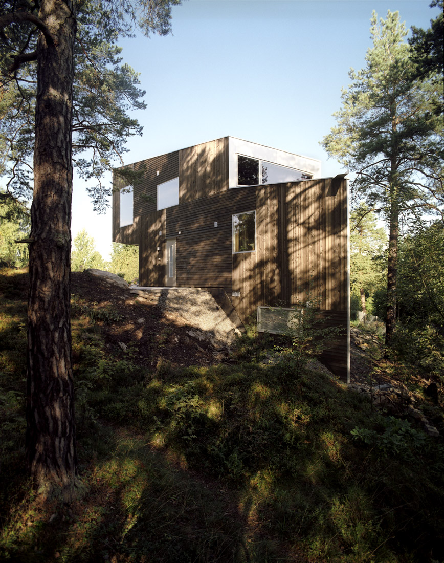
Felipe Assadi + Francisca Pulido: GUTHRIE HOUSE

While the exterior views are singularly framed by the window openings, closely related to individual spaces, the interior is treated in a more fluent way with overlapping sequences of space and light in section and plan. This duality of focal and flow is the theme of the building.
JVA Architect: TRIANGLE HOUSE

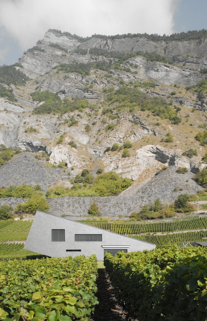
The sloppy roof is in harmony with the east and west sides of the mountain. The fitting’ slates is an image of the stone stratum. Its shape and material structure is the unique inspiration to plan the house. Formally, the house looks like a stone block lying on the ground in a fragile balance. It is covered with a skin of natural slates.
Nunatak Sarl Architects: ZUFFEREY HOUSE

Kieran Timberlake Associates: LOBLOLLY HOUSE

Thursday, October 14, 2010

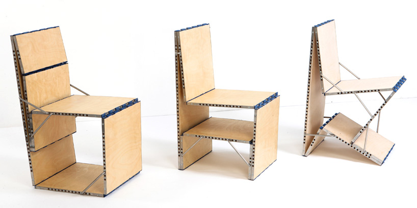
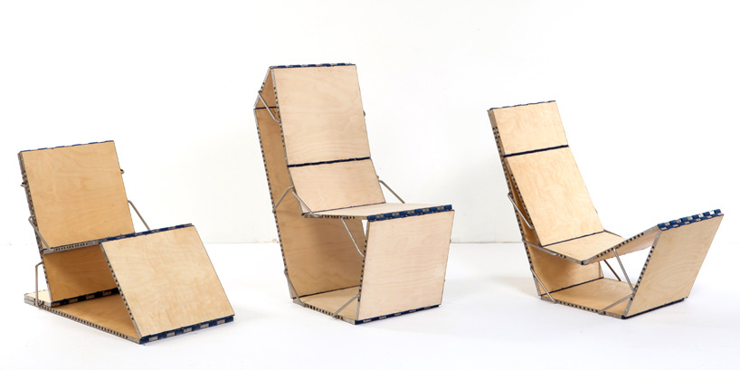
Loop chair - The multi-function furniture by Boaz Mendel

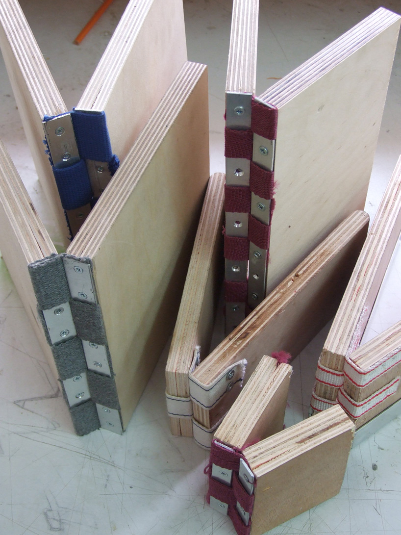
'Loop Chair' by Boaz Mendel, constructed from seven boards varying lengths that are connected by hinges - folding the hinges in the loop can create a nine variation of furniture - in various state.


See Loop Chair


the loop chair modifies and form 9 different kind of furniture

Detail Connections:


Wednesday, October 13, 2010

Flexibility in Design

Tiny Apartment Transform into 24 Rooms: Creative efficient way to save space.


Small area means efficiency, domestic transformer, using sliding wall units - the house move to adjust his needs - room he wants to be in at that moment.

Youtube Video- See how a 344 sq ft apartment - turned into a multifunctional space:

Tuesday, October 12, 2010

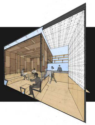
Ini Ani Coffee Shop

Woke up at 5:30am, snooze my alarm until 6am. Then finally forced myself to wake up for a IDE class group meeting. Thoughts in my mind- Toronto is way too boring at 7:00am in the morning, nothing going on outside to hang around for another 30 minutes before my group meeting. So, I walked over to Shuter & Church for a reviving coffee at Starbucks. This is when sitting at the Starbucks, i was thinking about IRN, looking at my cup of coffee reminded me of the coffee shop at NYC.

New York City

Project Description: 
350 Sq Ft. 
Less than three months in construction
Budget less than $40,000.
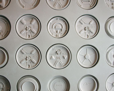
Wall Detail: Plastic Coffee Cup Lid
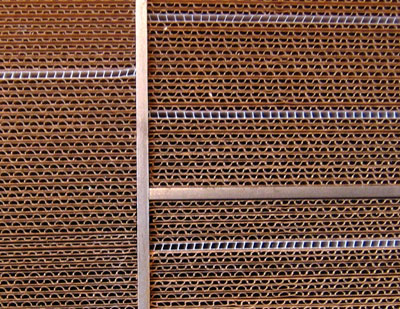
Wall Detail: Corrugated Cardboard

Interpretation:
In my opinion, this project very successful in the adaptive re-use materials, rough texture of corrugated cardboard and plastic coffee cup lids to create this dramatic contrast. Use 479 plastic lids and more than 50 variations, forms an fabricated piece of wall art and created a strong impression on the customers.
 

Monday, October 11, 2010

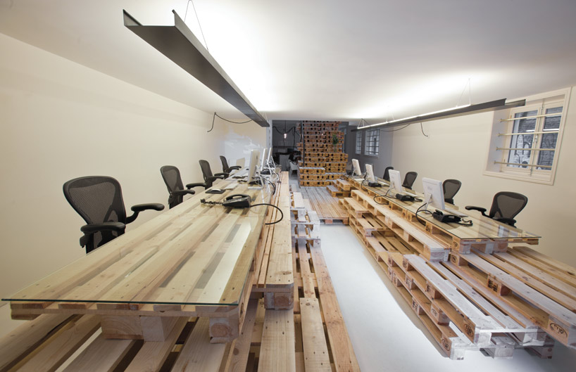
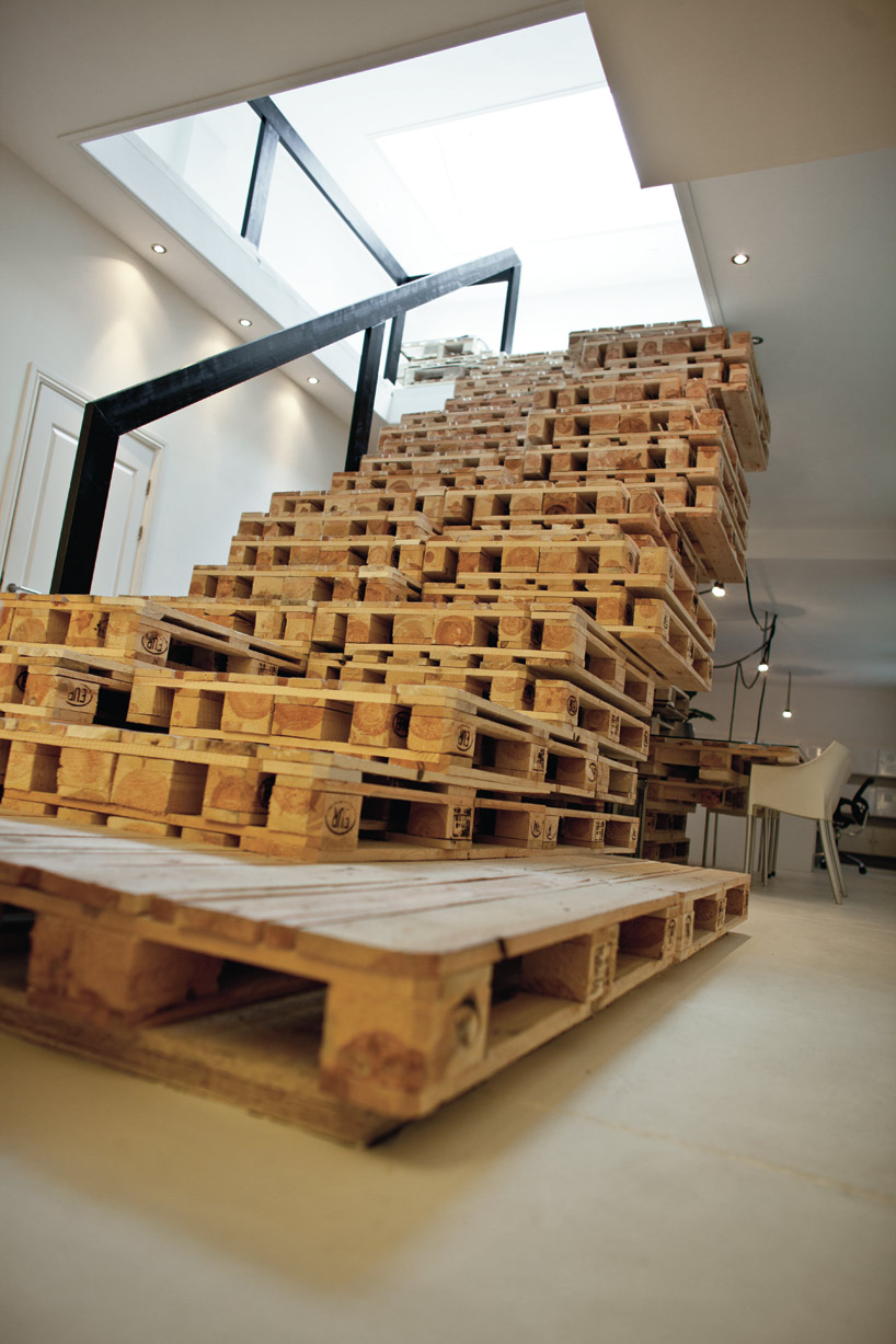
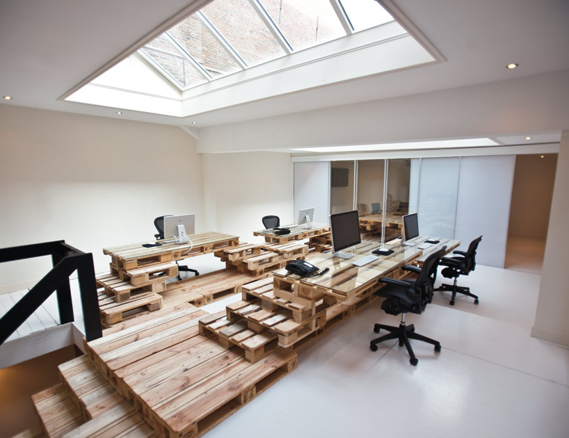
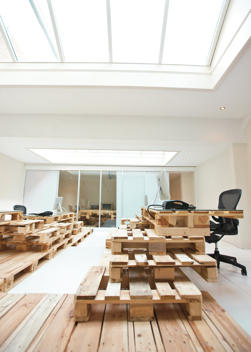
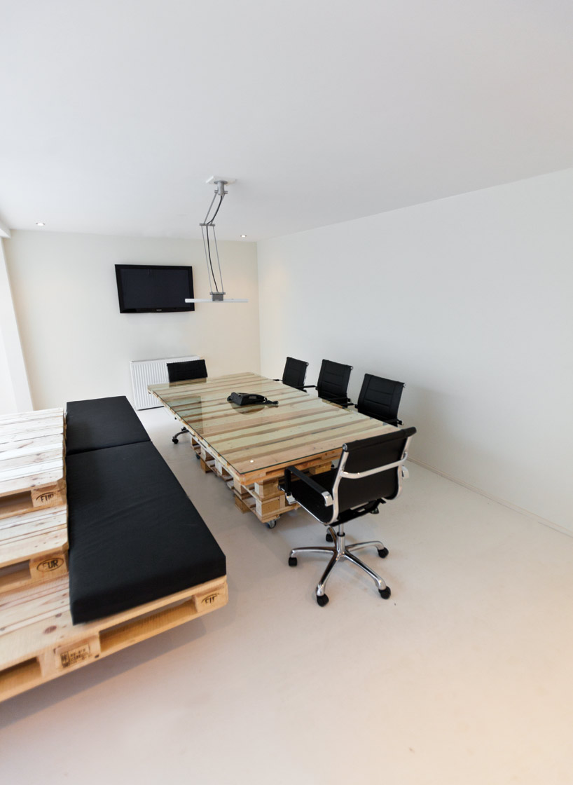
Most Architecture: Brandbase Pallet

Interpretation: Always use what we have accessible, be a creative thinker, give what we create - the importance of reuse to reduce waste. There are many products out in the environment that we can use in design. Discover the materials, what is available - it can just be around the corner.
The design is not as practical, using pallets can be very unsafe - splinter and sharp edges. Another factor, is pallets are just for structural purpose in this design, lacking (storage spaces).


However, I like the fact the architect is a creative thinker- adaptive reuse. Since this is just a temporary space, why not use something temporarily, low budget and can dispose easily.


project info:
architects: most architecture
client: brandbase bv
location: brouwersgracht 246, amsterdam
design: may 2010
completion: july 2010
number of pallets: 270 pieces
surface: 245 m2
building sum: 50.000 euro
Temporary space with temporary objects - idea of pallets to furnish the space with recyclable materials.


See Link: BRANDBASE PALLET

Saturday, October 9, 2010

VIA Commuter Bike

Allow a safe and sustainable ride.


This bicycle concept, features a big frame primarily made from reinforced recyclable polypropylene. Other components, such as back wheel, seat-post, handle bars made from aluminum for durably to insure strength in structure. VIA bike features with built-in front, rear and pedal lights.


Will you go with this "VIA"?


Interpretation: How cool would it be if we have a URBAN CITY and we just have to use this as our transportation to get to everywhere we need - no need other forms of vehicle transportation - car, bus, train.

Friday, October 8, 2010

Interpretation of E.1027


Looking at: [Inside to Outside]
  • Embrace the Natural Contours
  • Analyze the Light
  • Movable and Multifunctional Furniture
The area's landscape is unique: on a steep cliffside along a coastline view of the Mediterranean Sea. E.1027 is targeted towards the sensibility of the Eileen Gray's wants for a retreat. The scheme is design to custom the client's needs, detail to functional space and private/public space. The architecture and furniture complements each other, interacting and enhancing the space; every function is exposed. 

Eileen Gray's furniture and accessories became an intimate complement to their architectural settings. These elements of construction harmonize functionalism and a sophistication rarely attained in contemporary furniture; shown through the use of screens and built-in furniture to divide the spaces. Her furniture are modular- movable and multifunctional.

From what i researched, the most interesting factor in E.1027, was the level of research she pursued before she began the project. She had studied the terrain and decided not to alter the typography; Instead design around what is existing, to let the house embrace the natural contours. Eileen Gray analyze the light directions, through the use of horizontal opening and studied the wind to make use of all elements. Level of detail in playing with light was the strongest feature in E.1027. 


House: "A Shelter"

A house is closely related to a shelter - a mother's womb. When I want to get a rest, away from the busy world - home is where i want to go.


The home: the place where people spend most of their time and investing all their love and passion.


Depending on the designer and client, a house can be very cutting edge and searching for a new paradigm- "Think Outside The Box" - it can accept rules and form new ones.